Why a Clear Route Changes How a Public Room Works
A clear route through a public room helps visitors find the entrance, move between activities and choose where to pause without disrupting others.
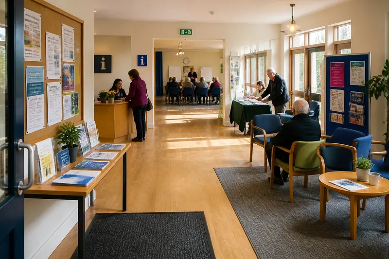
You step into a neighbourhood hall and stop just inside the door: a noticeboard, a table of leaflets and a cluster of chairs all compete for attention. A clear route through a public room makes the next move easier to read, whether you are arriving for a meeting, looking for a service desk or simply passing through.
The route is more than an aisle between furniture. It is the sequence of cues that helps someone understand where to enter, where to go and which parts of the room are for different activities. When those cues make sense together, people can use the space without needing a guide to explain it.
What makes a route easy to understand?
Start with the entrance. A visitor should be able to recognise the public doorway and see, or readily identify, the next useful point: a reception table, a sign, a waiting area or the main room beyond. If the door opens onto stacked chairs or a queue, the room’s first message is confusion.
From there, look at the path people are expected to take. It should connect the entrance to the activities and services that visitors are likely to seek, without sending them through a group that is already using the space. A route need not be a marked line on the floor; furniture placement, sightlines and consistent signs can make it legible.
Think of the route like a sentence: the entrance introduces the room, and each clear cue helps the visitor understand what comes next. A sign that points one way while an open doorway and prominent table suggest another leaves the sentence unfinished.
How should movement and activities share the room?
Separate movement from lingering where the room allows. A corridor-like path along one edge may let visitors reach a desk or meeting area while others sit, read a notice or talk. If the only way across the room cuts between chairs, people who are moving and people who are staying can interrupt one another.
Activity areas are easier to understand when each has a visible purpose. A table with forms and a clear sign can read as a help point; a group of chairs facing one another suggests a discussion area. Keep materials that belong together in the same zone, and avoid placing unrelated displays where they obscure the doorway or compete with the main destination.
Zones do not always need screens or permanent partitions. A change in furniture direction, a rug, a low display stand or a distinct sign may be enough to show where one activity ends and another begins. Leave sightlines open where staff need to welcome visitors or where people need to see whether a service point is available.
What should you check when arranging a public room?
Walk the room from the perspective of someone arriving for the first time. Check these points before opening the space:
- Entrance: Is the public door easy to identify, and can it open without meeting furniture or a queue?
- First cue: Can a visitor see a sign, welcome point or other indication of where to go next?
- Route: Is there a clear way to reach the main activity without weaving through seated groups?
- Activity zones: Do furniture and signs make it apparent which areas are for waiting, conversation, information or services?
- Access: Can people using mobility aids move through the intended route and approach the places they need?
- Noise and interruption: Are quiet or focused activities set away from the busiest path where the room permits?
- Changeover: Can chairs, tables and displays be moved or reset without blocking the entrance or leaving an unclear route?
Use the answers to make one practical decision at a time. If the entrance is hidden, move a display or add a clear sign; if a waiting group blocks the path, relocate the waiting chairs or service point. For access needs, follow the venue’s arrangements and seek appropriate advice where a change could affect safe use.
How can a room stay clear as activities change?
A public room often serves different purposes across the day. The route that works for a quiet drop-in session may be crowded when a class ends and another group arrives. Rather than treating the layout as fixed, identify the elements that should stay consistent: the entrance, the main route and the place where visitors can ask for help.
Then decide which elements can change. Folding tables, stackable chairs and movable signs can support different activities, provided their new positions do not obscure the route. A simple room plan kept with the venue’s setup materials can help staff and volunteers return to a familiar arrangement after an event.
Say a community room hosts a form-filling session in the morning and a craft group later. Imagine the organiser moves the information table away from the doorway, keeps a visible path to the help desk, and shifts craft supplies to a side table. The expected result is that new arrivals can identify where to ask for help, while the craft group has space to work without placing its materials in the main route.
What do visitors need to know at a glance?
Signs work best when they answer an immediate question: “Where is the reception desk?” or “Is this area for waiting?” Use plain words, place the sign where someone must make a choice, and keep it visible from the approach. Too many notices at the entrance can bury the one instruction a new visitor needs.
Pay attention to what the room communicates without words, too. A desk facing the entrance looks more welcoming than one turned towards a wall; chairs arranged in a circle invite conversation, while a row of chairs beside a doorway can look like a queue. These cues should agree with the signs and the activity taking place.
What do people ask about routes through shared rooms?
Does a public room need a marked walkway?
Not always. A visible, unobstructed path created by furniture placement and clear sightlines may be enough, while floor markings can help in a larger or busier room. Choose a cue that fits the space and does not create a new obstacle.
Where should a reception or information table go?
Place it where arriving visitors can spot it without blocking the entrance or the route to other activities. If it must serve several purposes, use a clear sign and keep its materials together so people can tell what help is available.
How can a small room support several activities?
Give each activity a recognisable area and keep the main route free of furniture that is not in use. Movable chairs and tables can help, but a quick reset plan makes it easier to restore the same clear entrance and path between sessions.
What if visitors still seem unsure where to go?
Notice where they pause, turn back or ask for directions, then check what they can see from that point. A sign may need repositioning, or the furniture may be directing attention away from the intended destination.
A clear route through a public room is built from small, consistent signals: an identifiable entrance, a straightforward path and activity areas that look distinct. Before the next session, stand at the door and ask what a first-time visitor would notice first. If the answer points to a useful next step rather than an obstacle, the room is already easier to use.